If we want to plot something that changes with time and the time period is relatively short, we often use a linear scale. Thus if we were considering 1,000 years, the linear scale might look like this:
Each tick mark represents 100 years and each subdivision of the scale would be the same length.
When we consider the many thousands of years it will be necessary to store nuclear waste in a geologic repository, it would not be possible to represent the decay on a linear time scale. So we resort to a convenient device called the logarithmic scale for plotting large numbers.
In the logarithmic scale the only line segments that are equal are those that represent multiples by a constant factor, such as 2 or 3 or 10. So 1,000 years on a simple logarithmic scale that showed only the broad divisions would look like this:
As you can see, such a scale can plot a great many more years than is possible on a linear scale, but its use would be limited by its lack of detail.
However, if we were to divide each broad segment into nine segments and let the ticks represent the years from 1 to 10, 10 to 100, and 100 to 1000, the scale would look like this and would be much more useful:
Note that each broad segment is subdivided in the same way. Each tick within a broad segment represents a multiple of 10 over the corresponding tick in the previous segment. For example, in the segment 100to 101 the first mark equals 2. In the segment 101 to 102 the first mark equals 20, and in the segment 102to 103, the first mark equals 200.
Notice that the line segment between 10 and 20 is equal to that between 20 and 40, which is equal to that between 40 and 80. Similarly the segment between 10 and 30 is equal to that between 30 and 90.
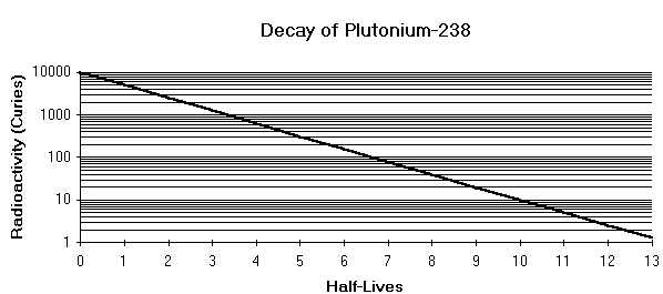
That’s all there is to it! Try this worksheet on logarithms if you would like to practice your new skills! (Hint: use the Pu-238 decay chart below for reference)


